Web Design Best Practices for Accessibility and User Experience

In today’s web design and development landscape, creating accessible, user-friendly, and responsive websites is more important than ever. This tutorial will guide you through key best practices in web design and development, focusing on accessibility, flexibility, and performance. By following these principles, you can create websites that are not only visually appealing but also inclusive and functional for all users, including those with disabilities. Whether you’re a beginner or experienced web design or developer, these tips will help you design and build websites that are both effective and sustainable.
Color Contrast for Better Accessibility
Color contrast is critical for users with visual impairments, particularly those with color blindness. The Web Content Accessibility Guidelines (WCAG) recommend ensuring a sufficient contrast ratio between text and background to make content readable for everyone.
- WCAG 2 AA Contrast Ratio:
- The recommended contrast ratio for normal text is 4.5:1.
- For large text (18pt or 14pt bold), the ratio can be 3:1.
Tool to Test Contrast: Use the Color Contrast Analyzer to check the contrast of your text and background colors to ensure they meet the required thresholds.
Example: If your background color is light gray (#D3D3D3) and the text color is dark gray (#333333), you can use the analyzer tool to check if they meet the contrast ratio standards.
Using Relative Units for Font Sizes and Dimensions
Relative units like em and rem make your website more flexible and accessible. They allow text and elements to scale proportionally based on the user’s settings.
em:
- The size is relative to the parent element’s font size.
- Useful when you want to scale elements within a container.
rem:
- The size is relative to the root (html) font size, typically set to 16px by default.
- Preferred for setting consistent typography across the site.
Best Practice: Use rem for setting base font sizes and layout dimensions because it scales consistently across different components. Use em for components that need to scale based on the parent context.
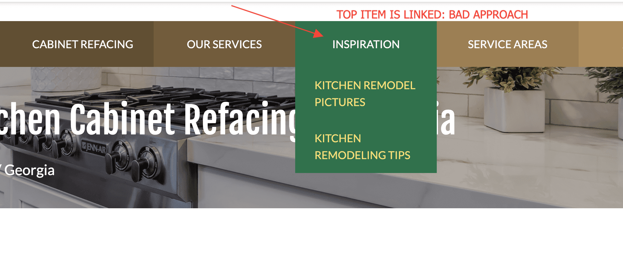
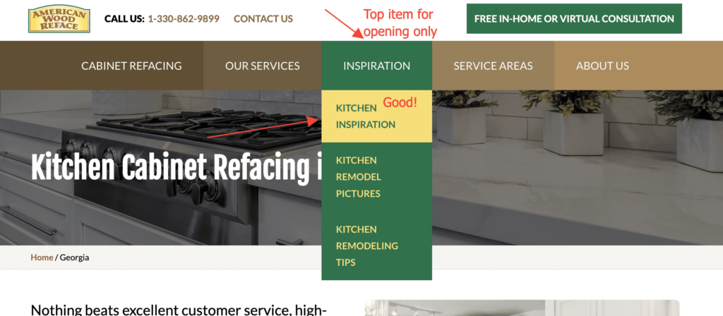
Why Top-Level Links for Dropdown Toggles Are Not Advisable on Mobile
Mobile users rely on touch interfaces, and clicking on a top-level link in a dropdown can cause confusion or errors, as the dropdown may close unexpectedly or require multiple clicks to navigate.

Best Practice: Avoid using a link as a toggle for a dropdown. Instead, use a button or icon with proper semantics, such as aria-haspopup and aria-expanded, to indicate that the button opens or closes a dropdown. This enhances accessibility and usability, especially for mobile users.

The Importance of Alternative Text for Images
Alternative text (alt text) is vital for users who rely on screen readers. It provides a description of the image content when the image itself can’t be seen.
Best Practice: Always include meaningful alt text for images. Avoid leaving alt text empty unless the image is purely decorative (in which case, use alt="").
Example: For a logo image, use descriptive alt text such as:
<img src="logo.png" alt="Company Logo">Using SVG Format for Logos and Icons
Why it Matters: SVG (Scalable Vector Graphics) is a resolution-independent format that ensures images, such as logos and icons, look crisp at any size or screen resolution. SVGs also allow for styling via CSS and are often smaller in file size compared to raster formats (e.g., PNG).
Best Practice: Use SVG files for logos, icons, and illustrations to ensure scalability and better performance.
Inline SVG Embedding
Embedding SVGs directly in your HTML (<svg>) rather than using an external <img> tag has several benefits:
- Scalability and Styling: Inline SVGs can be styled using CSS, allowing for dynamic styling changes such as color or size adjustments.
- Performance: By embedding SVGs directly, you can reduce HTTP requests, improving page load times.
- Accessibility: You can add
aria-label,role, and other accessibility attributes to improve screen reader interactions.
Best Practice: Use inline SVGs for logos, icons, or any graphics that require styling or interaction with JavaScript. Here’s an example of inline embedding:
<svg xmlns="http://www.w3.org/2000/svg" viewBox="0 0 100 100" aria-label="Icon description">
  <circle cx="50" cy="50" r="40" stroke="black" stroke-width="3" fill="white" />
</svg>
This allows you to target the SVG elements with CSS and JavaScript, and you can also ensure proper accessibility by adding the appropriate ARIA attributes.
Using aria-labels for Anchor Tags/Links
Anchor tags (<a>) should clearly describe the action they will take, especially for screen reader users who may not have visual cues about the link’s destination.
Best Practice: Use aria-label when the link text is ambiguous, or if you need to provide more context. This ensures better accessibility and clarity.
Example:
<a href="https://example.com" aria-label="Visit our blog">Blog</a>Mobile-First Design Approach
Mobile-first design ensures that your website is optimized for smaller screens before adding larger-screen optimizations. It improves performance, accessibility, and user experience on mobile devices.
Best Practice: Start with a mobile-first approach by designing the smallest screen versions of your site first and using media queries to scale up for larger screens. For example:
/* Mobile-first styles */
body {
  font-size: 88%;
}

/* For larger screens */
@media (min-width: 768px) {
  body {
    font-size: 100%;
  }
}
Use of Web Fonts
Web fonts can help create a unique and visually appealing typography style for your website. However, it’s important to ensure proper performance and avoid blocking render times.
Best Practice:
- Use
font-display: swapto prevent flash of unstyled text (FOUT). - Limit the number of font families to reduce page load time.
- Choose system fonts as fallback options for faster rendering.
Using System Font Stack (Web Safe Fonts)
Defaulting to the system font of a particular operating system can boost performance because the browser doesn’t have to download any font files, it’s using one it already had. That’s true of any “web safe” font, though. The beauty of “system” fonts is that it matches what the current OS uses, so it can be a comfortable look.
Example:
/* System Fonts as used by GitHub */
body {
  font-family: -apple-system, BlinkMacSystemFont, "Segoe UI", Roboto, Helvetica, Arial, sans-serif, "Apple Color Emoji", "Segoe UI Emoji", "Segoe UI Symbol";
}
Don’t Minimize Spacing Between Lines of texts
The spacing between two lines of text is called line height. By increasing the line-height, you increase the vertical white space between lines of text, generally improving readability in exchange for screen real estate. As a rule, the line height should be about 30% more than the character height for good readability.
Example:

Conclusion:
By following these best practices, you not only improve the accessibility and user experience of your website but also ensure it meets key guidelines like WCAG 2.0. Make your website flexible, readable, and enjoyable for all users, including those with disabilities.

