The user experience of a website has deeper effects that are overlooked from a digital marketing perspective. What “makes the cut” is, many times, just a matter of how aesthetically pleasing the site appears. Although it is important to be visually appealing, it is most important for a business to consider all aspects of the end user’s interaction with the site.
When designing a website, there are many aspects that should be considered: What is the user’s motivation? What action does the business want from the user? How many steps does it take the user to complete their objective(s)? The ultimate goal is to combine these steps in ways that help your website naturally rank on Google (Search Engine Optimization: “SEO”) and complete actions quickly.
SEO and User Signals

Some design elements that are directly related to the aforementioned, in regards to SEO, are your website’s Bounce Rate (do they enter your site and leave quickly?), time spent on your website, and if they return or go to another website to complete their objectives. The biggest culprit of this, in the past, was whether a page was mobile-friendly/responsive or not. Nowadays most pages are responsive so we have to look deeper at other design elements.
CLS (aka Culamative Layout Shift) Update
Recently (May 2020), Google released a new update to its core algorithm that directly takes into consideration the level of frustration that some users experience online. Basically, Google is monitoring your actions within a webpage and has diagnosed when you become frustrated (or having issues) with a website. The best example of this is when a user enters a webpage, begins to read, and a new image or ad begins to load. This new load then moves the user’s content and they must now scroll to a new section of the page to find their original content.
A quick remedy to this would be to set the loading order of your webpage so that the page loads as the user scrolls. In web development, this is commonly referred to as “lazy loading” which only allows elements within a webpage to load when they are needed.
Proper Headings for Quick Navigation

The proper use of Headers has been on Google’s radar for some time. No one wants one large body of text to sort through. Headers help streamline the reader’s ability to find relevant information, particularly to their search. Some important notes on the use of headers to help you with your site’s organization and ability to rank higher in search engines are:
- Use only 1 H1
- Follow the format of H1, H2, H3 and never out of numerical order
- (Good) Eg: H1, H2, H3, H3, H2, H3, H3, etc..
- (Bad) Eg: H1, H3, H2.
Remember, these are used to logically order your articles’ or contents’ hierarchy of thought.
How a Website Should Navigate
Regardless of your audience, there are some simple steps we can take to ensure that the user spends time on your site and can navigate easily from page to page. When it comes down to it, you want to ensure that your audience doesn’t need to jump through hoops to get to where they want to go. Put yourself in your user’s shoes. If you were trying to purchase something online and you had to click 4-5 times to get to the correct page, would you exit the site and look for one that only required 1-2 clicks? The desire to conserve energy is in our nature, and this nature is no different in the online world. Simply put, your user should get the information they desire while putting forth minimal effort.
Choosing The Proper Website Navigation
When deciding on how your page navigates there is a multitude of options out there. To decide or choose the most effective option, one must consider their current and target audiences and the statistics around how they function. For instance, the top sites used by Gen Z are Youtube (91%), Gmail (75%), Snap chat (66%), Instagram (65%), and Facebook (61%). If you were trying to market to this type of crowd, (born 1995- 2015) then it would be appropriate for you to research how these apps or sites are navigated and to mimic this navigation in your own design. On the other hand, if you are targeting a Baby Boomer crowd (born between 1944-1964), who tend to use the internet for informational purposes such as sending emails, using google and checking the news. Then you might want to cater to your site’s navigation in a way that is easy to find facts, look up processes, and read in-depth content.
Tips for Creating Simple Yet Effective Website Navigation

Here are some steps you can take to assure your site is easy to navigate.
- Keep it simple: Don’t over complicate information or add content just for the sake of content.
- Respect your user’s time: No one wants to feel like they are doing work, so don’t make them work for it.
- Use styling to focus the user’s attention to key areas: Don’t over stylize, but save the eye-popping elements for the important stuff. Don’t be afraid of white space. This can often speak greater volumes than an overcomplicated design. There is so much information out there taking up headspace that we as humans are generally more attracted to the simplistic. It’s almost like a breath of fresh air.
- Test your website with users from your target audience and use their feedback.
Remember that site structure can make or break your user experience and the trickle-down effect of what this has on your site authority can be tremendous. If users can not figure out how to use your site, they will inevitably leave and not return affecting your site’s ranking. And even more so, a well laid out site makes it easier for Google to index your site which in return will have positive effects on your ranking.
Color and Visibility on Your Website
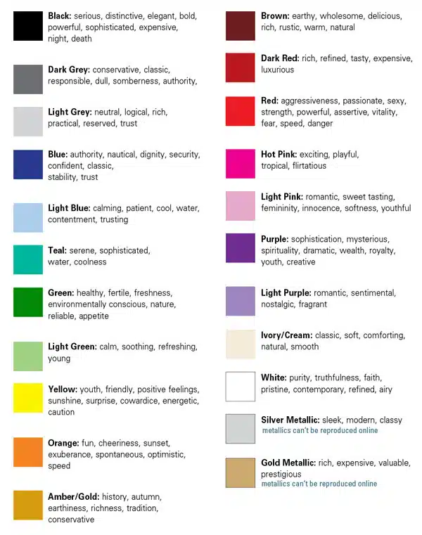
When users interact with your website color plays a huge role in how the user perceives the experience. Since color has a vast impact on how we feel, this in return affects how the user experiences your website. In the same ways that the right color can highlight and improve visibility of your service or product, the wrong color can break your user experience which in turn affects your bounce rate and return rate.
When it comes to color and composition, simplicity is generally the best practice. Bright colors and highlights may seem effective, however, too much color can overload the brain resulting in a cluttered jumbled mess. Check out these resources on how color and design can communicate your message.
Lastly, consider the meaning of the color you are using and the message it sends to your user. You can use this chart to find if you are sending the correct message. As always, the colors on your website should align with your brand as all of your social platforms should. Color consistency brings brand awareness, trust, and instant recognition to your page.
Website Composition and User Flow
Composition plays a huge part in how effective your website is, just as the composition of an add affects sales. Before building your site, make a wireframe or outline that lays out your most important information and in what order you would like your user to see it. Using the AIDA method is a great way to map out the importance and order of your content images and CTA.
The AIDA Method
- Awareness: Create awareness of an issue or pain point to draw attention.
- Interest: Create interest by providing content that appeals to your target audience.
- Desire: Create a strong desire for the product or service you are selling by offering key points and information regarding your offering
- Action: A strong call to action to close your deal.
As a general rule of thumb, this information/ content should be simple enough to fit above the fold. Any fine details for those users seeking more information should be placed below the fold.
Be the Fastest: Load Time

Website load time has shown to have an impact on your visitor’s behavior. Consider this: your user is in an area with bad reception (like an airport) and is browsing your site to make a purchasing decision. If every page takes 2-3x more time to load, the chances to have that customer make a purchase drops dramatically. According to Google, users will spend less time on a website if the load time is increased. You and your developer should always aim to have your website load in less than 3 seconds. That way your visitors have a great experience even in the worst of conditions.
There are many free tools available to help you determine your website load time that will give your developer insight into what is clogging up your website’s load time. One of our favorites is GT Metrix. Another, but noted to be a very strict grading system, is Google Pagespeed Insights. The most common methods to decrease your website’s loading time are:
- Compress your website’s images
- Reduce unnecessary code
- Reduce the number of redirects on each page
- Limit the number of videos per page (iFrames)
Mobile is Always First

The mobile formatting of your website is one of the most important variables to consider. As of 2019, mobile traffic was up from 16.2% in 2013 to 53.3%. Additionally, 58% of organic search traffic was on mobile. There are many details to keep in mind for your website as you decide on a design. Your search rankings do depend on the quality of your mobile website. Make sure not to remove information that is on your desktop version. It is important to keep all information, especially text. The following section will go into more detail about formatting specifications.
Conclusion
These tips, In addition to keywords and other well-known factors related to SEO, can help to improve your rankings significantly. As a general rule of thumb, simplicity is key. Simplifying your design will help you attain the proper color and composition, load time, and navigation which will greatly increase usability having a positive impact on your SEO. When in doubt, keep these rules in mind:
- Keep it simple (less is more)
- Use friendly colors
- Keep your website fast
- Make it easy to read (think mobile!)
This blog was written in collaboration with Dustin Fatch of Marketing Done Right and Jenna Raus in the Marketing Department of Odell Construction Inc.